
BEACHES JAZZ FESTIVAL
2025
The Beaches Jazz Festival is one of Toronto’s largest free music festivals, held annually throughout July. The project focused on developing a modern brand system that better reflects the energy of live jazz and the community-driven atmosphere of the event.
This quick collaborative design sprint with designer Maria San Martin Celi focused on exploring a brand refresh. The objective was to design a cohesive, scalable identity that works across advertising, digital platforms, and festival merchandise while improving overall brand recognition.
Skills
Brand Identity
Brand Design
Art Direction
Brand Strategy
Logo Design
Design System
Web Design

The Problem
A visual audit revealed several issues with the existing identity:
•
Inconsistent branding across promotional materials
•
Weak visual recognition due to lack of a distinctive system
•
Limited scalability across large-scale advertising and digital platforms
•
Minimal connection to the vibrancy of jazz and festival culture
Design goal
Develop a bold and flexible identity system that captures the warm and eclectic rhythm and energy of jazz while remaining highly functional across multiple touchpoints.


Brand Strategy
The brand concept was built around three core attributes:
Rhythm
Inspired by the movement and structure of jazz music
Community
Reflecting the open, accessible nature of the festival
Summer energy
Capturing the warmth and energy of outdoor street festivals
These principles informed the typography, colour palette, and graphic language.
Visual exploration focused on:
•
Vintage jazz poster aesthetics
•
Bold typographic compositions
•
Bright summer colour palettes
•
Funky street festival graphics
•
Abstract shapes inspired by musical rhythm
The goal was to balance retro jazz influence with a fresh and contemporary graphic style, with the inclusion of custom elements.

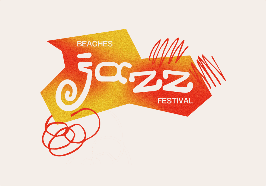
Brand Identity
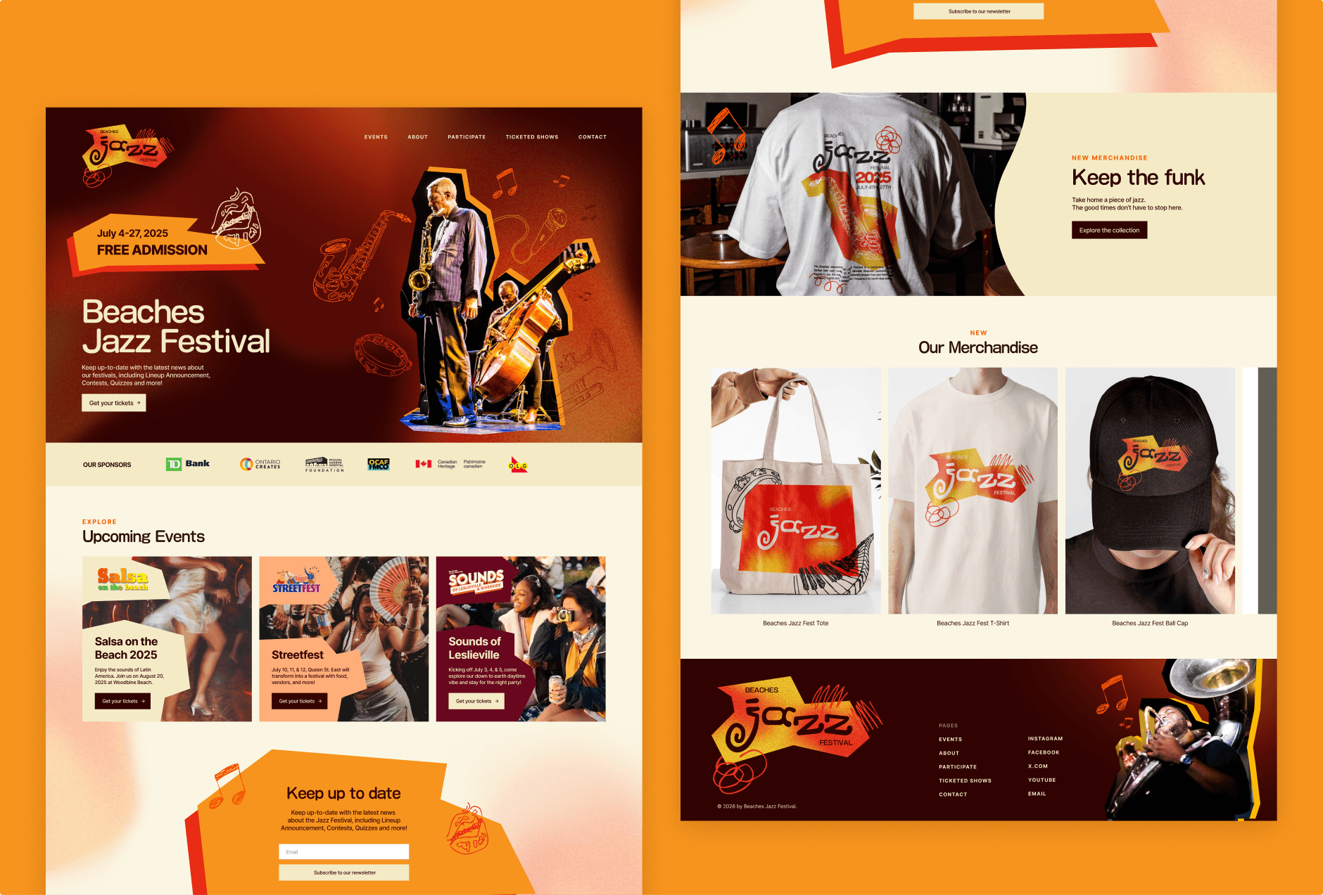
The identity system centers on bold typography, vibrant colour, and rhythmic graphic elements to capture the energy of live jazz and the vibrancy of a summer street festival. From here, Maria and I wanted to soften the visual language a bit, and implement a custom type logo with hand drawn supplementary graphic elements.
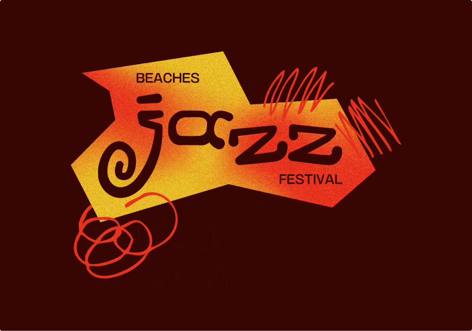
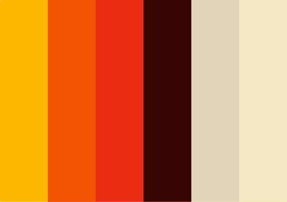
Colour System
A vibrant, and warm high-contrast palette was introduced to reflect the energy of the summer and ensure strong visibility across outdoor advertising, digital platforms, and merchandise.
Custom Typography
Custom letterforms create a bold, recognizable voice for the festival. The typography emphasizes geometric structure and rhythmic forms, reinforcing the musical character of the brand while remaining highly legible at large scale.
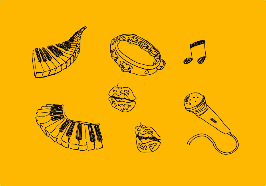
Graphic Elements
A set of modular vector elements introduces movement and visual rhythm inspired by jazz. These graphics add energy to layouts and extend the identity consistently across applications.


Design System
The final system was designed for consistency and scalability across all festival touchpoints.
Advertising
The identity was designed to scale across large-format applications including billboards, bus shelters, and street-level advertising, ensuring strong visibility and brand recognition.
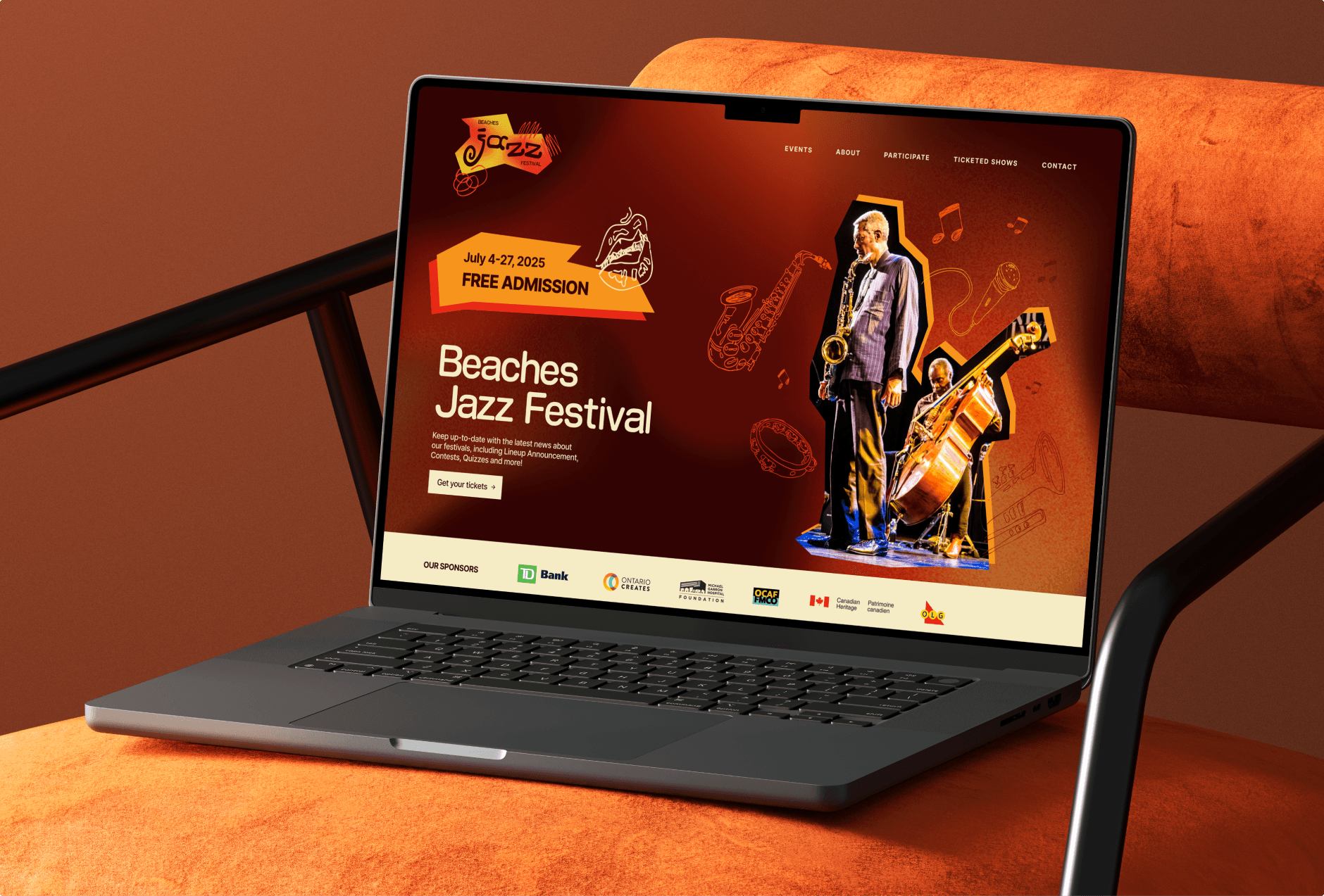
Digital
A landing page concept applies the brand system to a digital environment, maintaining consistent typography, colour usage, and graphic elements.
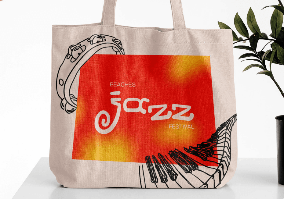
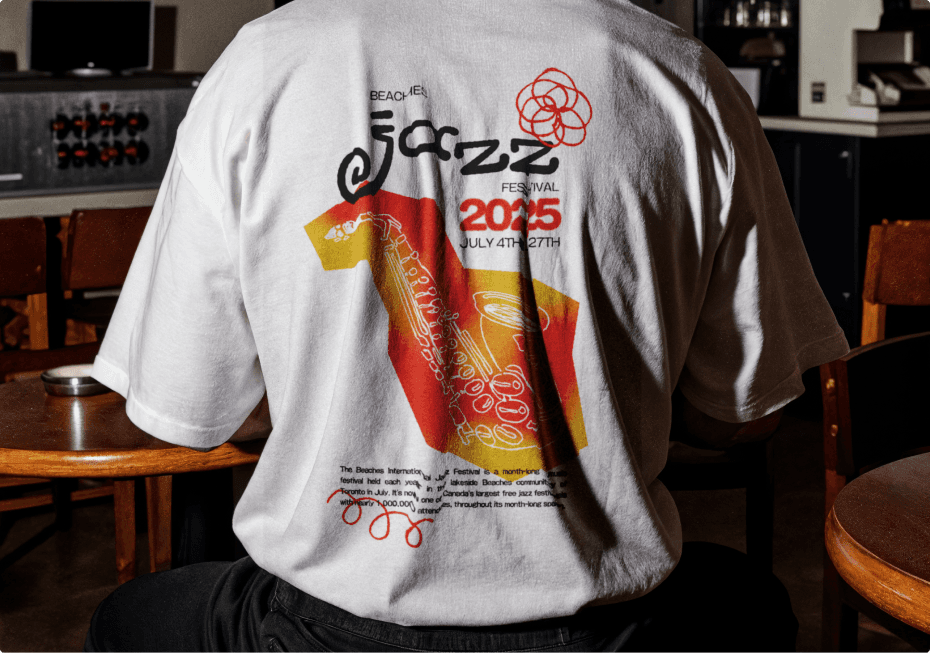
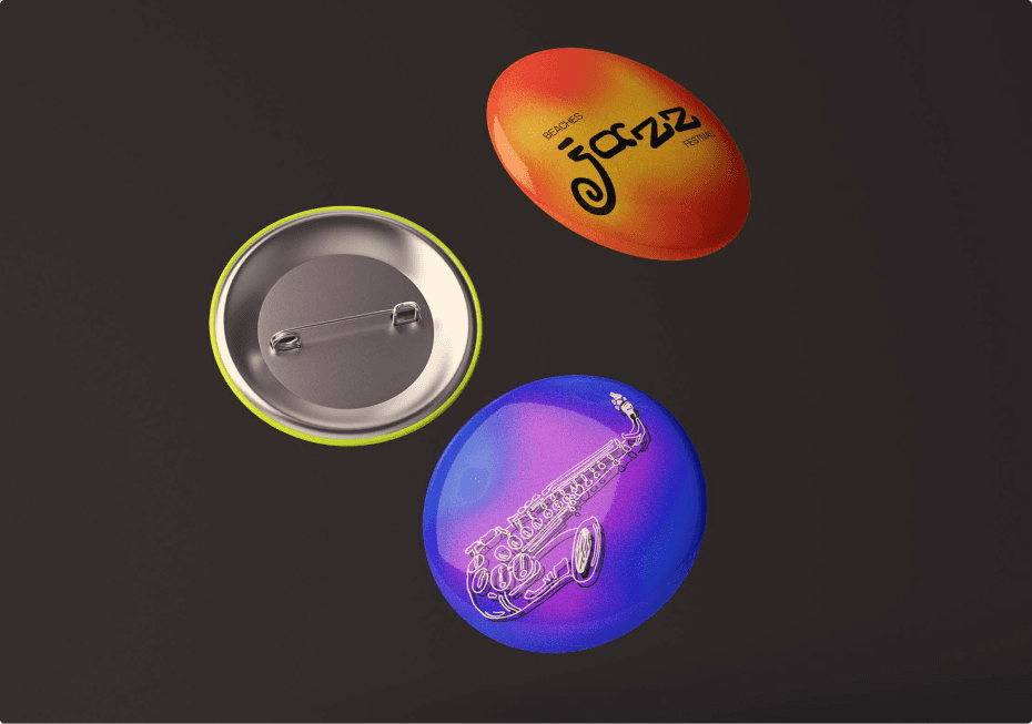
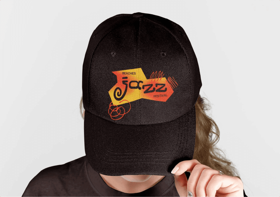
Merchandise
Branded items such as T-shirts, tote bags, and buttons extend the identity into wearable and collectible formats, reinforcing the festival’s presence beyond the event.
Environmental Graphics
Festival flags and on-site signage use the system to create a cohesive visual experience throughout the event space.

Next work
